Consultation
Consultation

Boost engagement, retention, and conversions.


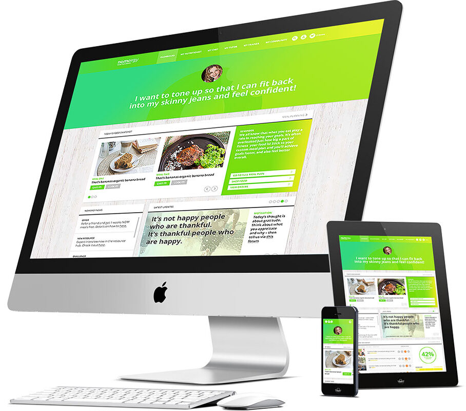
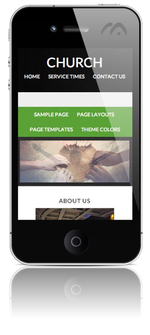
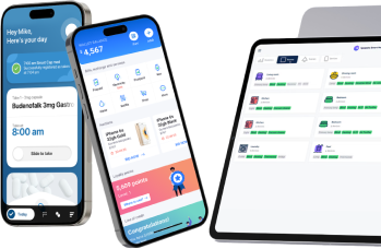
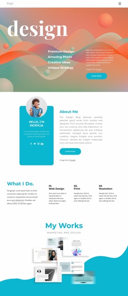
Fluid design systems that adapt content automatically.


Responsive sites boost navigation, boosting engagement and lowering bounce rates.

Google favors mobile-friendly sites in rankings.

Your site adapts seamlessly to new screen sizes and devices without rebuilding.


We start by analyzing your target audience, defining your product objectives, and assessing user behavior.


Guiding Your Idea from Concept to Launch with Care and Support


Recently worked with Ahamed to update our company's website. He was extremely responsive and help provide excellent recommendations on how to improve our websites look and speed. After the project was completed, he continued to provide excellent support. I would highly recommend Ahamed and the KSSNK group to any company needing website development.
I have had the pleasure to work with Ahamed Ansari Mustafa , the Founder & CEO Kssnk Technologies and I am happy to report that I had a totally amazing and most gratifying experience. Ahamed has successfully recreated an old and out-of-date Wix website and thoroughly re-designed it to a state-of-the-art professional and innovative Word press site! Unbelievable!
Ahmed and his team did a fine job migrating my website over from an old platform to an updated platform.I am grateful to him for the courage and patience in taking on such a project for a website with hundreds of pages.He was honest and trustworthy in everything. I highly recommend him...
I found the services provided by Ahamed Ansari Mustafa and his team exceptional. My needs were met with great professionalism and technical expertise. Their attention to the details were a welcome relief for me. The distance between our physical locations were less a factor than I would have thought. I would highly recommend Ahamed and the KSSNK group if you're in need on site development.
I would highly recommend Ahamed for several reasons. First, the quality of the work was outstanding and done in a way that did not require additional correction for mistakes. Second, it was done in a timely manner and according to the agreed upon timetable. Third, the rates for work were very reasonable given that this was a relatively simple website rebuild.
Ahmed was a pleasure to work with. He delivered on all our high expectations. We would highly recommend Ahmed. Thank you and best regards, Marcela Hollywood
KSSNK built our entire BigCommerce site from the ground up, and the results were outstanding. From the start, Ahamed, the CEO, worked closely with us to plan out our vision and then executed it flawlessly. The team was professional, responsive, and detail-oriented every step of the way. They understood exactly what we wanted and delivered a site that is both visually impressive and highly functional. Communication was clear, timelines were met, and every challenge was handled with expertise. We couldn’t be happier with the final product and highly recommend KSSNK to anyone looking for top-quality website development.
We have been working with Ahamed and his team for more then 2 years now and the experience has been great. They have done a great deal to fix all the issues we had left by our previous development company, solved any problem we have given them, and given guidance with future projects.
